Case Study: PowerPhone is a technology company providing software and training for 911 emergency centers and specifically for call handlers…
PowerPhone Inc. is respected world wide as a champion of innovation in the public safety communication industry, providing continuing education training and state-of-the-art technology for public safety dispatchers. Since 1984, PowerPhone has been improving the standard of care for emergency dispatch centers around the country. Today, over 238,800 students have been trained with PowerPhone’s industry-leading courses.
Challenges: PowerPhone website(s) and collateral materials were in need of a complete technical overhaul and important UX , visual, and informational overhaul.
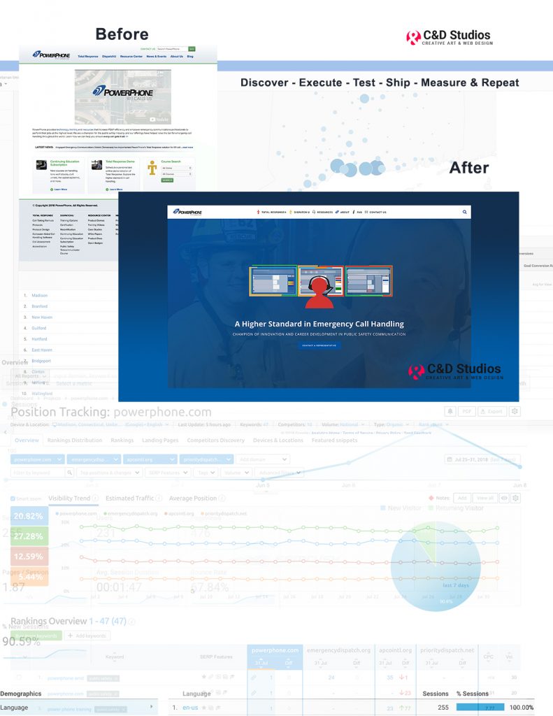
Strategy: Provide a new state-of-the-art WordPress website with refined information architecture and strong calls to action. Produce new graphics with state of the art web animations, visual icons, and new videos. Include Pardot form integrations with training for their own in house marketing teams. Incorporate web animation and SEO optimization with Yoast, followed by research based on heat maps and user flow recording for follow up use study research.
Tactics:
- Stakeholder Interviews
- Use case scenarios
- Information architecture
- CTA’s
- Onboarding
- Competitor analysis
- Keyword research
- SEM Rush
- Google analytics and metrics analysis
- Mobile first design
- Visual design
- Web animations
- Design walk throughs
- Integration of larger business goals with customer (and user) needs.


With their Total Response Call Handling System and Dispatch U Continuing Education Service, PowerPhone is setting the bar for public safety communication training and technology. Their new website will allow them to reach more dispatchers and emergency service dispatch centers, resulting in more capable and confident throughout the United States.
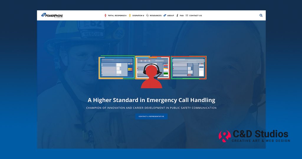
We have created PowerPhone’s brochures for print, updated staff headshots, and all of the open graph images for social media. The new website features SVG animations, designed by myself and animated by Jackie D’Elia, as well as custom SVG icons and all new product explainer and intro videos. Their new website meets basic accessibility standards, and is fully mobile responsive. Additionally, we also transformed their old web presence from a very confusing and difficult-to-navigate brochure-style site to a marketing-driven, Call-to-Action based website with updated navigation, styling, and visuals.

Leave a Reply