I am married to an amazing human who is also known as a very talented baseball pitcher. We enjoy both baseball and design very much. A few years ago we were watching a game (Red Sox) and discussing the art of pitching the ball. While Dominic was describing a pitching strategy, I realized that there are a lot of principles that run parallel to how I create visual compositions. That is the exact moment that I began adopting baseball pitching tactics into my visual design and communication compositions, quite literally.
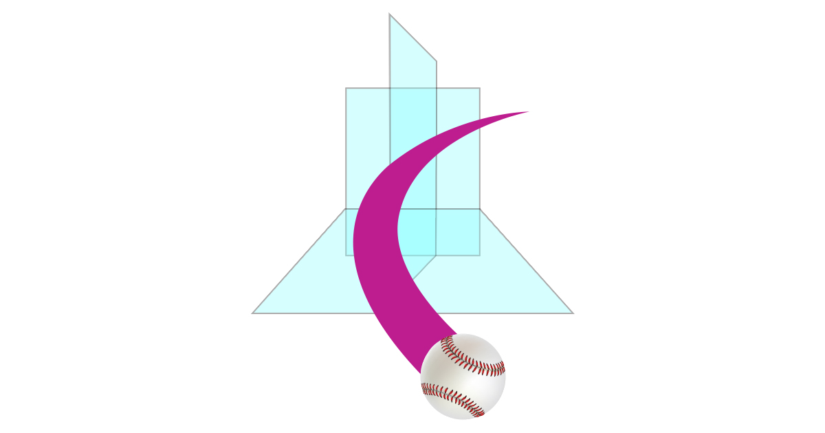
Let’s start by talking about baseball. A great pitch breaks three planes.
Break 3 planes with the baseball
A pitch thrown moving forward through space toward the plate as it breaks the first plane. Forward motion, as if moving through a glass window pane. That is the first plane.
A breaking ball is a pitch thrown in such a way that the ball drops or curves just before reaching the batter. Thus, breaking 2 planes with a single pitch and making it more dynamic and more difficult to hit.
A curveball is a pitch thrown with a strong downward spin, causing the ball to drop suddenly as it approaches home plate. Do you see the pattern? This pitch also typically breaks 2 planes. Forward motion and it drops braking a second plane as well.
A slider is a breaking pitch that is thrown with heat and similar movement to a curveball. However, this pitch breaks sharply, at a greater velocity than most other breaking pitches and it drops a little too. The slider breaks all three planes! (Forward, side-to-side, and it drops!) That is the magic and power of having a great slider.

Awesome right? I am sure it is not obvious how this “Break 3 Planes Law” is related to visual composition design. Furthermore, there are many other types of pitches but the ones that break 3 planes are super challenging for batters to hit and that really resonated with my thinking about visual perception when designing in 2 dimensions.
A few different pitches:
- Four-seam Fastball
- Two-seam Fastball
- Cutter
- Splitter
- Forkball
- Curveball
- Slider
- Slurve
- Screwball
- Changeup
- Palmball
- Circle Changeup
Learn more at Lokesh Dhakar’s site: Baseball pitches illustrated – A fan’s guide to identifying pitches
The “Break 3 Planes Law” for 2-D visual design communications
When working on a storyboard or a series of visual communication graphics I try to break 3 planes. And I still think of my husband throwing pitches, every time I do it.
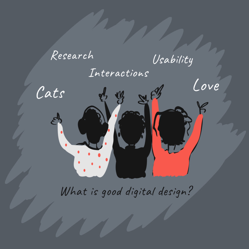
Here is an example from our series of compositions that illustrate the 4 freedoms for WordPress. These illustrations ship with each and every WordPress website inside the admin pages. WordPress powers over 38% of the web now so that’s a lot of websites! Can you see how the perspective changes at least 3 times?


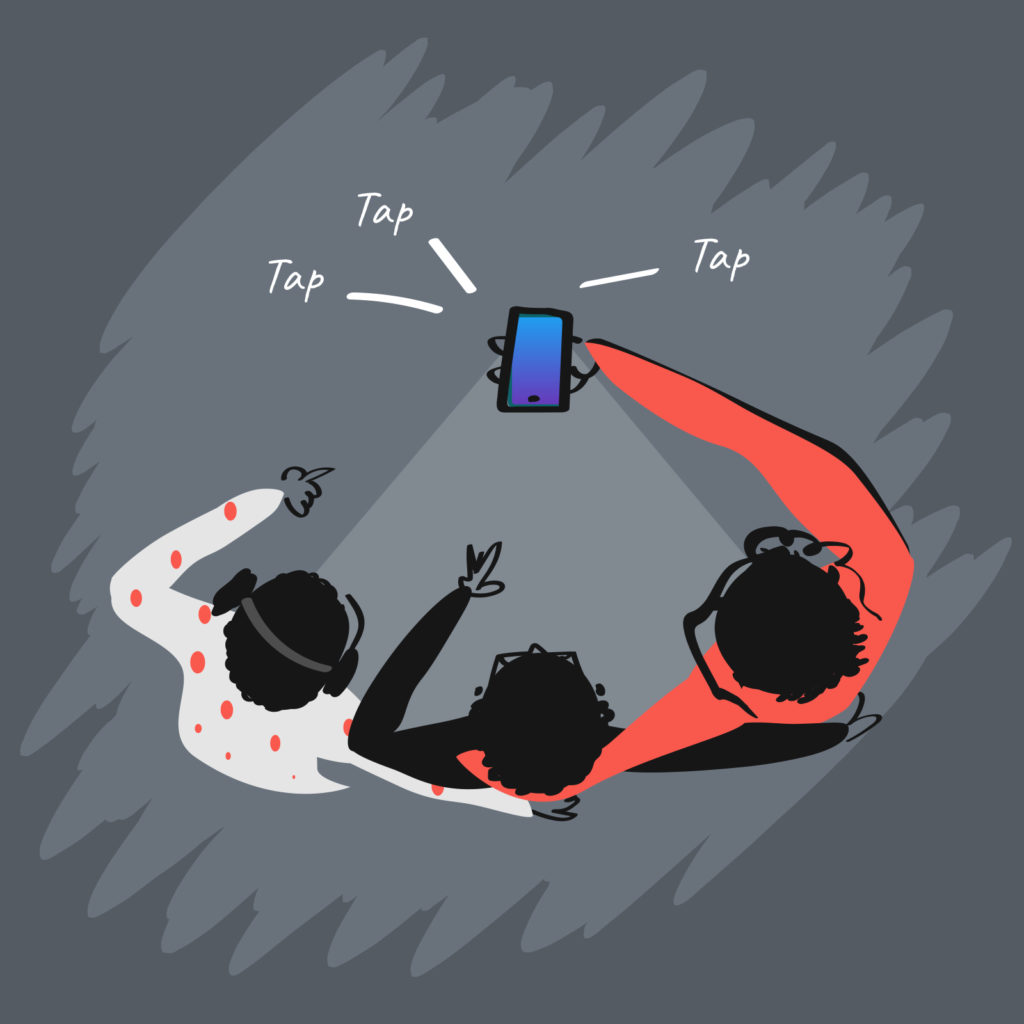
Here is another set of illustrations also loosely utilizing the “Break three planes” law for our rethink.fm podcast:


Changing the perspective or point of view can be a powerfully engaging way of communicating visually. A view could be straight on like looking through a window. Another perspective might be a low angle view like you’re a little mouse in the room, and you’re looking up at a family having dinner at a dinner table. Yet another perspective could be from behind and looking through objects, people, or things.
Additionally, as is so eloquently expressed in drone photography, is the aerial view. If you still need ideas don’t forget to go really close up in a macro view either. There are many ways to create compelling compositions including the ‘which one doesn’t belong’ composition. If you study photography you’ll gain lots of really interesting insights as well. There is an art to pitching a baseball and these principals can nurture creativity when designing visual communications too. Keeping a batter off-balance and gaining a strikeout is a different goal than successfully engaging with high quality visual communications. However, both are about interaction and relate to our visual perception.
Art helps us to see things in new ways… sometimes literally!
I learned about two-dimensional representation when I was very young and have been fortunate to teach kids in school over the years as well. Here are a couple of visual representation principles or tactics that we can utilize for digital screens and analog pages to inform our design work.
Size

Which of these objects appears to be closer? A larger size object drawn on a page or screen appears to be closer to the human looking at it.
Overlap

Which of these objects appears to be closer? The one being overlapped appears to be further away.
Position on the page

Which of these objects appears to be closer? As human beings whatever is lower on the page we perceive as being closer. What is closer to our feet we perceive as being closer to us. This breaks down a bit on screens that scroll potentially. I will think about this in terms of digital experiences. An animation sequence could be a replacement for this on digital screen experiences. This principle is interesting to consider and useful to compare analog and digital platforms.
Density

Which of these objects appears to be closer? The more density an object has the closer it it perceived to be.
Color

Which of these objects appears to be closer? Color, including color temperature can play a roll in our visual perception too. The hot red color is perceived to be closer that the cool cyan color.
In closing and for context about the 4 Freedoms illustrations, WordPress is licensed under the General Public License (GPLv2 or later) which provides four core freedoms and considers this to be the WordPress Bill of Rights as seen at WordPress.org.
Sadly, last week we lost a great artist and MLB (Major league baseball) published a tribute to the memory of Hall of Fame pitcher Tom Seaver.
I will likely update this post in the future and will provide an updated date at the top of the article.
I can be reached through our design collective at UXATT.
Leave a Reply